
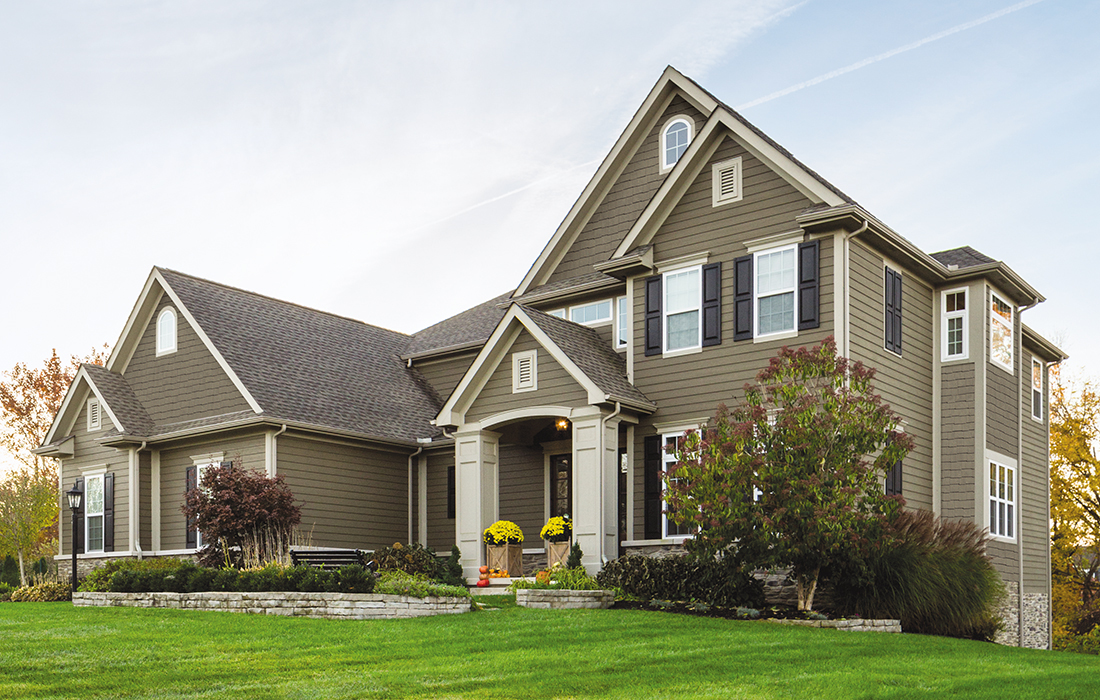
The most important rule for choosing a siding color is to start with the fixed elements already on the home, such as the roof, masonry, or trim, and choosing a siding color that works with them — not the other way around.
Reverse that order and you end up with a beautiful swatch that looks wrong on the actual house. Get the sequence right and the best siding colors become obvious.
Key Takeaways
- Start with the fixed elements. Roof color and undertone, brick or stone, trim, and architectural style will constrain your palette.
- The most common mistake is selecting from small samples indoors. Warm grays pull beige or green in outdoor light; cool grays pull blue or purple. Test large panels outside.
- High-contrast palettes (e.g., dark siding, white trim) feel modern and bold. Low-contrast palettes (e.g., tan siding, brown trim) feel calm and traditional.
The Four Anchors You Should Identify Before Looking at Siding Colors
Four fixed elements constrain your siding color palette in useful ways. Identify all four before you pull out a sample deck to eliminate half the decision paralysis.
1. Roof Color and Undertone
The roof is the largest fixed element on the exterior, and it carries undertones that will affect which siding colors work. A warm brown or tan shingle pulls yellow or orange, so it will pair best with warm whites, cream, taupe, or earthy green. A gray shingle might look neutral in the store but pull blue-purple (cool) or green-beige (warm) when viewed against a wall. Copper roofing, which sometimes shows up on higher-end Northern Michigan builds, brings warm red-orange tones that gradually shift toward brown-green as the metal patinas; creamy whites, sage green, and warm taupes are reliable pairings.
|
What is an undertone? An undertone is the secondary color cast embedded within a primary color. A gray siding panel may look pure gray in the showroom but read as green, purple, or taupe on the house, depending on the surrounding light and materials. |
2. Brick or Stone on the Facade
If the home has masonry, that carries its own set of undertones — often multiple at once. Red brick with pink undertones will fight cool blue-gray siding. Tan limestone with yellow undertones pairs naturally with warm whites and soft sage. Read the dominant undertone in the masonry, and choose siding that stays in the same temperature range.
3. Existing Trim and Shutter Colors
Trim and shutters frame the siding. A warm creamy white trim paired with a cool blue-gray siding won’t exactly look wrong, but it won’t look quite right either.
If you’re replacing trim and siding at the same time, treat it as an opportunity to design the full palette. If the trim is staying, it becomes another constraint to design around.
4. Architectural Style
A home’s architecture doesn’t dictate a specific color, but it does set the tone. New England colonials and cape cods look historically correct in muted blues, grays, and warm whites. Modern farmhouses carry bold contrast well.
| Northern Michigan lake homes, particularly those with large windows and natural material details, tend to hold their longest appeal when siding colors are drawn from the surrounding landscape: heathered greens, warm taupes, deep blues. |
What’s the Most Common Mistake When Choosing a Siding Color?
Ignoring undertones is the most common error people make when selecting siding colors.
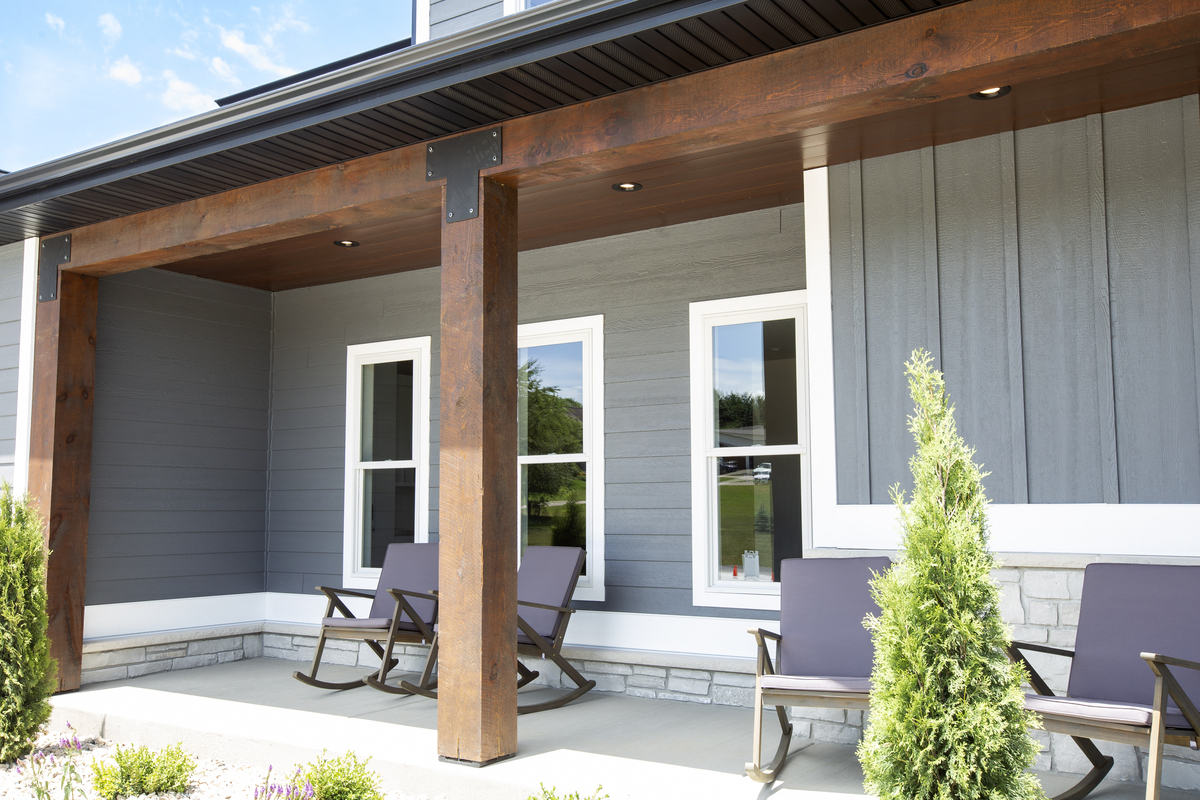
Small chip samples viewed under fluorescent showroom lighting don’t show you how a color will behave in full sun, at dusk, on a cloudy Northern Michigan afternoon, or alongside the specific undertones of your roof and trim.
| Siding Color (as it appears on the chip) | Undertone It Often Pulls Outdoors | Pairs Well With | Watch Out For |
| Warm gray | Beige, taupe, or mossy green | Brown/tan roofs, warm white trim, earthy green accents | Cool blue-gray trim, cool gray roofs |
| Cool gray | Blue or purple | Charcoal roofs, cool white trim, blue accents | Red brick, warm brown roofs, cream trim |
| Off-white/cream | Yellow or soft pink | Warm gray and brown roofs, warm tan shingles | Cool gray trim, slate-blue accents |
| Bright white | Blue or cool lavender | Dark gray or black roofs, charcoal trim | Warm brown roofs, cream or warm-toned trim |
| Beige/tan | Orange or yellow-green | Warm brown roofs, brick facades | Cool gray roofs, slate-toned trim |
| Navy/deep blue | Purple or teal | Black or dark gray roofs, white trim, stone accents | Warm brown roofs without a cool trim buffer |
| Sage/earthy green | Yellow or gray-green | Cedar, warm tan roofs, natural stone | Cool gray roofs, very bright white trim |
| Charcoal/near-black | Blue or green | Most roof colors; pairs best with crisp white trim | Very warm roofs without a cool undertone to bridge the gap |
The fix is straightforward but requires patience. Order full-size panels or large sample boards, not chips. Take them outside and lean them against the exterior wall near your roof edge and trim. Look at them at noon, at 4 p.m., and in the morning. Live with them for a few days before you order.
Not sure where your home falls on this chart? Our team can help you work through the anchors and narrow the options down to a shortlist worth testing outdoors. Browse Siding Options & Request Samples →
|
Our Experience We’ve had homeowners come in completely certain about a color. Then we lean a full-size panel outside next to their roof sample, and the undertone shifts on them. Usually a warm gray going mossy green, or a cream going yellow-pink. The light changed everything. That’s why we don’t send you home with just a chip card. |
How Do Color Temperature and Contrast Shape the Look of a Home?
Color temperature (warm vs. cool) and contrast (how much the siding and trim differ) affect how large, modern, traditional, or settled a home appears from the street.
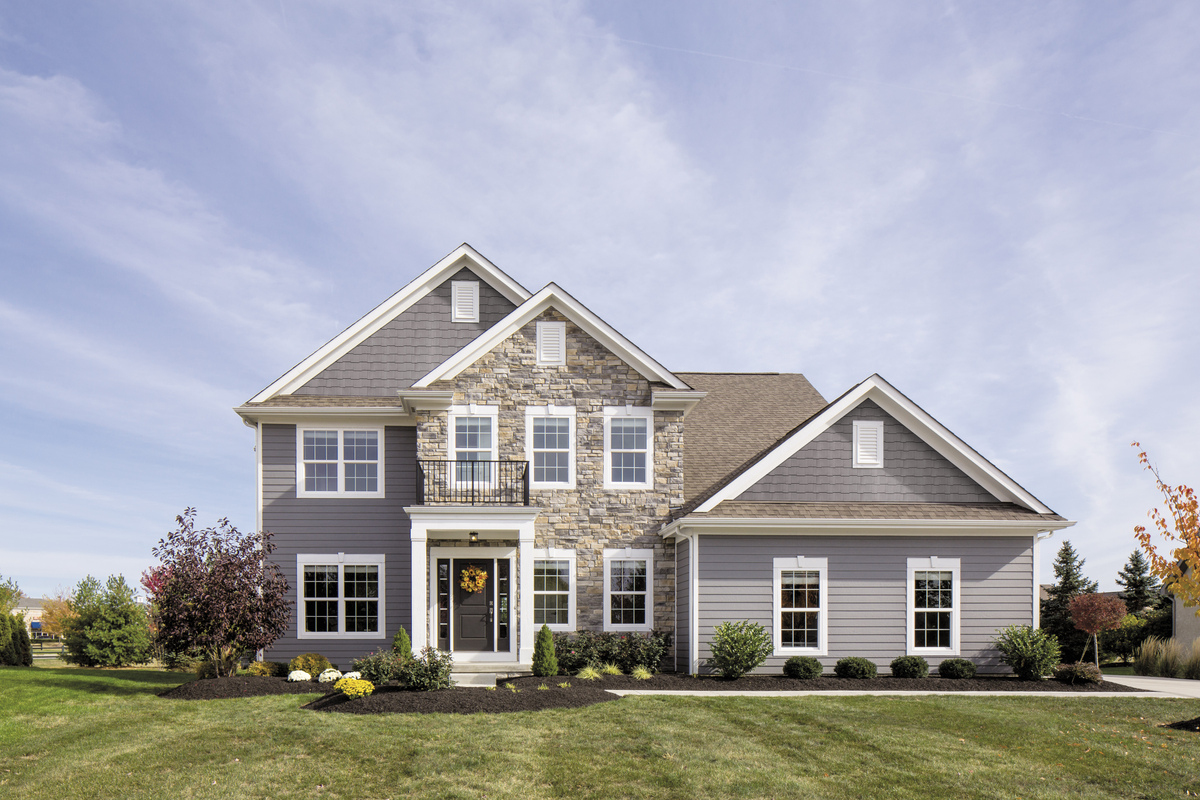
Low-contrast palettes keep siding and trim in a similar color family. This might look like:
- Soft warm white siding with off-white trim
- Mid-gray siding with a slightly lighter gray trim
- Taupe siding with brown trim
They tend to suit traditional architecture like colonials, cape cods, and craftsmen, and they age well without looking dated.
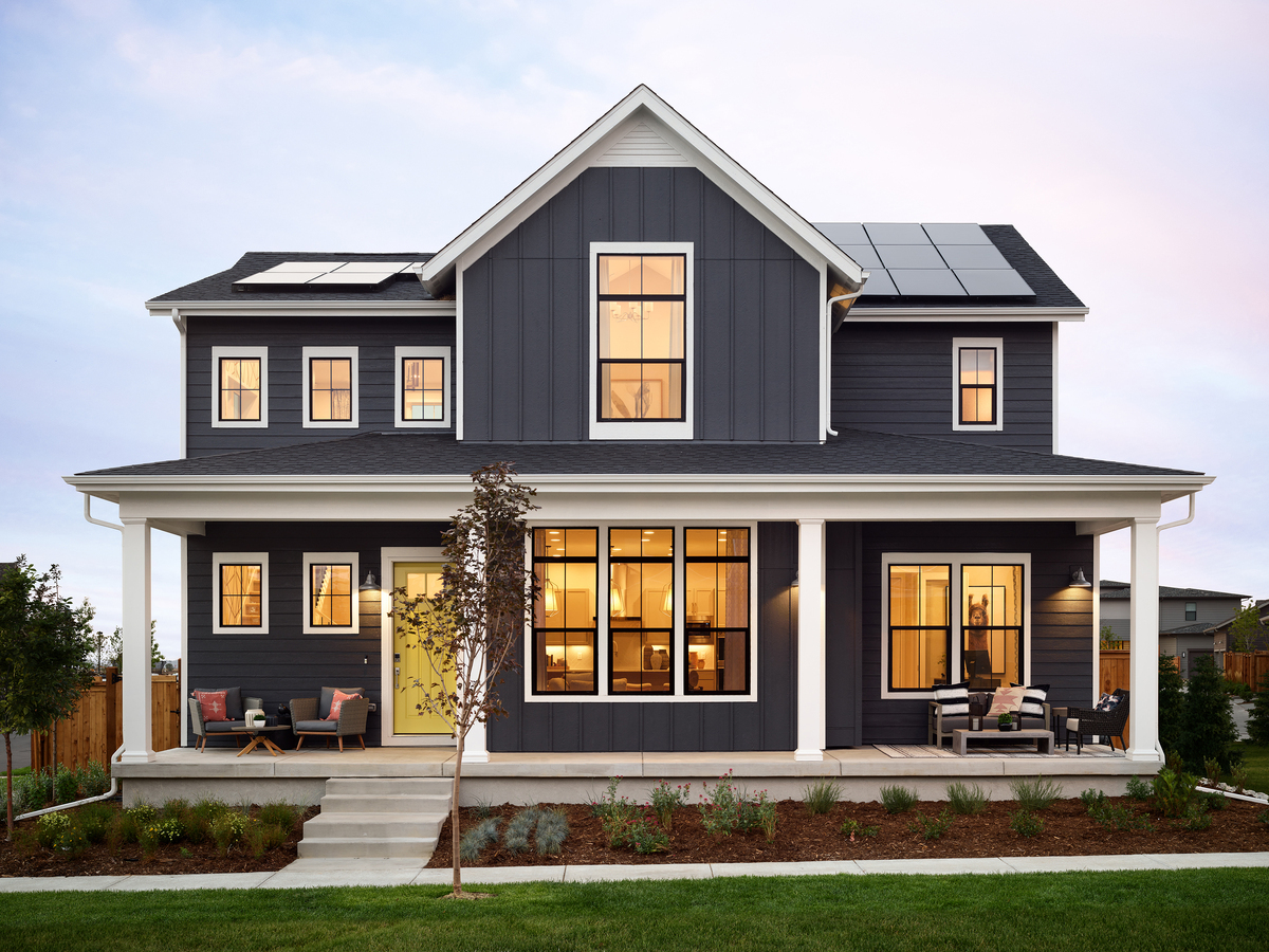
High-contrast palettes push a significant difference between siding and trim. Deep charcoal siding against bright white trim is the most popular example right now. It reads modern and intentional. However, the trade-off is that high-contrast amplifies every architectural detail, including any that are imperfect.
What Siding Colors Are Popular in Northern Michigan Right Now?
Four color directions have momentum in Northern Michigan exterior projects. In February 2026, the National Association of Home Builders’ (NAHB) Best in American Living Awards pointed toward darker exterior hues and nature-focused design elements.
Warm white siding is the most enduring choice on the list. It’s difficult to get wrong, pairs with nearly every roof color, and doesn’t carry the trend risk that bolder options do. Warm is an important modifier, though; a cooler, brighter white can look institutional against certain architectural styles. Look for undertones that read cream, linen, or very pale taupe.
Deep charcoal and blacks are popular siding colors right now, particularly paired with white trim, black-frame windows, and natural wood accents. It’s a striking combination, and it photographs really well. However, this palette is associated with a specific design cycle so it’s worth asking whether you’ll still love it in 15 years before paying good money for it.
Earthy greens like sage, muted olive, and deep forest have shown staying power. They feel grounded in the natural landscape, which is a particularly strong fit for Northern Michigan properties near water or tree lines.
Navy blue siding has more longevity than most trend colors because it reads as classic rather than contemporary. In lakefront and coastal context, it belongs in the landscape. It pairs well with warm whites, natural wood trim details, and stone foundations.
|
Design Tip Northern Michigan homes that draw colors from the surrounding environment (water, cedar, birch, stone, sky) tend to hold their curb appeal longer than those that chase national trends. The landscape gives you a palette that never goes out of style. If you’re not sure where to start, walk outside and look around. |
How to Test a Siding Color Before You Commit
Testing is a smart idea for a finish that will last 20+ years. Here’s how to do it so you can make a confident color choice.
Order large samples from your supplier, not chip cards. We carry sample panels from top brands like LP® Smartside® and James Hardie™, and they’re the closest representation of how the real installed product will look.
Lean the panels against the exterior wall near your roofline and trim. Then observe them across at least three conditions: direct sun, overcast light, and early evening.
Check them from the street, not just up close. Siding is read from 30-50 feet, and a color that feels rich and subtle at arm’s length can look washed out or heavier at a distance.
Look for two things as you evaluate:
- Does the undertone stay consistent, or does it shift toward something unexpected in a different light?
- When you stand back and look at the panel next to your roof and trim, does something feel slightly off without you being able to name it?
Live with the samples for a few days before placing an order. The right color will probably feel more obvious on day four than on day one.
Not Sure Where to Start? We Can Help.
At our Traverse City and Suttons Bay locations, we have a wide range of siding materials and colors from popular brands like LP® and James Hardie™. We can help you narrow siding color options using real samples and local light, not digital renderings. Contact Us →
Frequently Asked Questions About Siding Colors
What color siding goes with a gray roof?
It depends on whether your gray roof runs warm or cool (the undertone table above shows exactly what each gray family pulls). Warm gray shingles (with beige or tan undertones) pair well with warm whites, taupes, and earthy greens. Cool gray shingles (with blue or purple undertones) work with cool grays, slate blues, and crisp whites.
What color siding goes with a copper roof?
Copper carries warm red-orange undertones that shift toward brown-green as the metal patinas over time. Siding colors that work well lean into that warmth: creamy whites, warm taupes, and sage green. Deep forest green is a particularly striking pairing once the copper patinates, as the colors echo each other. Avoid cool gray and blue-gray siding with copper roofing, as those colors will fight the natural warmth of the metal.
What color siding goes with red brick?
Red brick carries warm undertones: orange, brown, sometimes pink depending on the specific material. Siding choices that stay in the warm family work best: warm whites, soft taupes, and warm-undertone grays. Earthy green is another strong pairing. Navy and deeper blues can work as a deliberate contrast, since blue sits opposite orange on the color wheel. Avoid cool grays and purples, which will clash with most red brick tones.
Does dark siding make a house look smaller?
Dark siding can reduce the perceived scale of a home by drawing the eye inward, but contrast management matters as much as the siding color itself. Dark siding paired with bright white trim creates a clear visual frame that can actually emphasize a home’s proportions. Homes with larger footprints tend to carry dark siding better than smaller ones.
Should siding be lighter or darker than trim?
In most residential exterior color conventions, siding is lighter than trim. Trim acts as a frame and tends to read best when it contrasts the siding slightly. That said, the rule isn’t absolute. Monochromatic palettes where siding and trim stay close in value but vary in finish are increasingly common and work well on modern architectural styles.
How many colors should a home’s exterior have?
Three is the standard guideline: a primary color for siding, a secondary for trim, and an accent for doors, shutters, or other architectural details. Going beyond three colors on a single façade can feel visually busy, especially viewed from the street. Homes with complex architectural detail (e.g., wraparound porches, mixed materials, board-and-batten accents) often benefit from a more restrained palette that lets the architecture speak rather than competing with it.
Ready to Choose a Siding Color? Start with Samples from Northern Building Supply.
Visit us at our Traverse City or Suttons Bay locations to see LP® SmartSide® and James Hardie™ siding samples in person. Our team can walk you through color selection, help you identify undertone conflicts before you commit, and connect you with installer support when you’re ready.